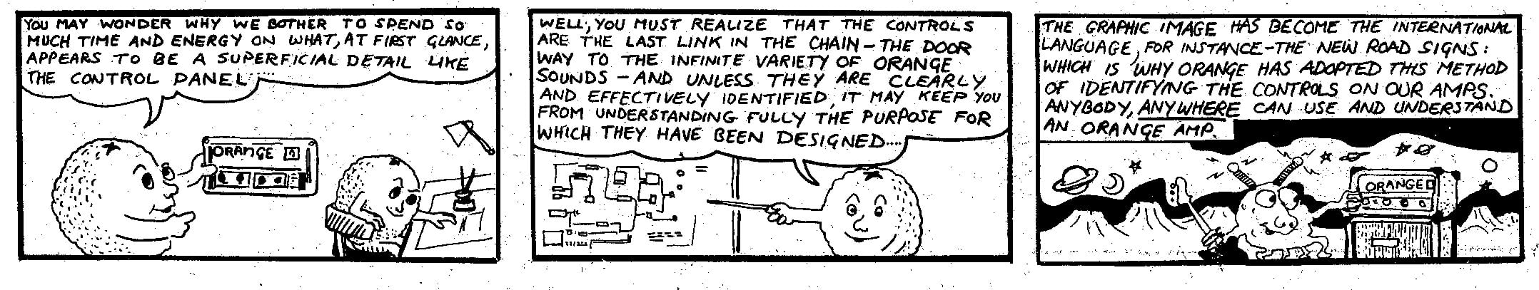
1971 - The Orange Graphics Explained
Cliff Cooper, Orange Founder and CEO
“I got the idea for graphic symbols on our amplifiers when I noticed the new road signs which suddenly appeared in the late 1960s. Instead of words, the signs used graphic symbols. In 1971, I suggested to the team that instead of using words we should use our own custom symbols, I wanted us to keep one step ahead. Years later, when we started manufacturing again in the 1990s, we decided to keep the graphics – these hieroglyphs were now a part of the brand.
The Orange logo on our amps is now near- perfect, whereas if you look at the original logo, it was hand drawn. The reason for this is simple – there weren’t computers in those days, and you had to engage an artist to draw it using French Curves.”
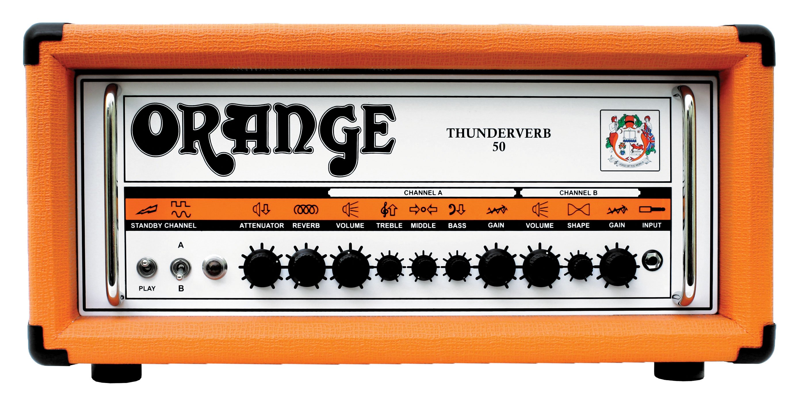
Thunderverb 50 Hieroglyphs 2007
Using comic strips in trade press advertisements was another first for Orange back in the early 1970s. Other companies were soon copying this idea. The cartoon shown below is just one of many that were devised by Orange.
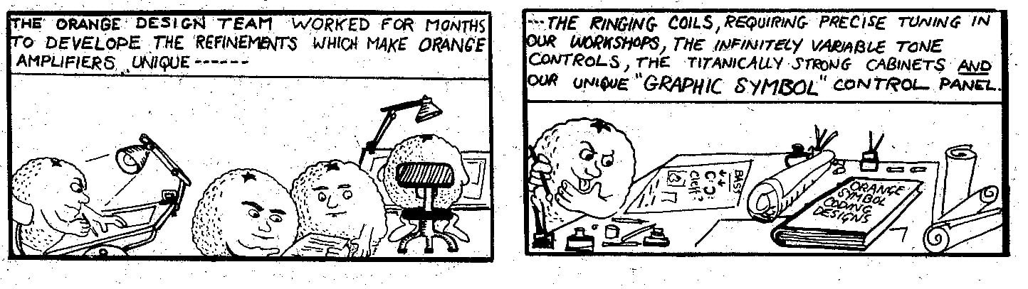
Icons Comic